Best Trade Show Themes for 2025: 25 Ideas to Inspire Your Booth
Trade show themes can make or break your booth’s success. A creative, well-executed theme draws in attendees, creates memorable experiences, and keeps your brand top of mind long after the event. Below are 25 unique booth themes with product giveaway ideas to help you bring each concept to life.

Technology & Interactive Trade Show Themes
These themes work exceptionally well for tech companies, software developers, telecommunications firms, and businesses showcasing digital innovation or cutting-edge products. The right trade show promotional products can amplify your tech theme and create lasting brand impressions.
1. Augmented Reality (AR) or Virtual Reality (VR) Demos
Transport visitors into immersive product experiences or virtual tours. Set up VR stations where attendees can explore your manufacturing facility, test drive products virtually, or experience your services firsthand. This theme works particularly well for companies with complex products that benefit from detailed visualization.
Themed Giveaway Ideas:
- Custom power banks with your logo
- Wireless earbuds in branded packaging
- Screen cleaners with microfiber cloths
2. Gamified Engagement
Draw a crowd with spin-the-wheel contests, trivia challenges, or giant Jenga branded with your messaging. Create a point system where visitors earn rewards for different booth activities, from watching demos to sharing social posts. This approach transforms curious visitors into enthusiastic participants
Themed Giveaway Ideas:
- Custom stress balls as contest prizes
- Custom drawstring bags for winners
- Branded T-shirts with your logo
3. Social Media Sharing Booth
Create an Instagram-worthy backdrop or interactive display tied to your brand. Design a photo opportunity with your products, add props that incorporate your brand colors, and create a custom hashtag. Include a monitor displaying the live social feed to encourage more participation.
Themed Giveaway Ideas:
- Custom phone grips with your logo
- Branded photo frames
- Stickers for laptops and devices
4. Charging Station Lounge
Offer a comfortable space for attendees to recharge devices and themselves. Set up charging tables with comfortable seating, provide refreshments, and use the downtime to have meaningful conversations with prospects. This theme positions your brand as helpful and considerate.
Themed Giveaway Ideas:
- Wireless charging pads with your logo
- Branded cable organizers
- Custom wall chargers with contact info
5. Interactive Smart Displays
Use touchscreens and LED walls for product demos or data visualizations. Create interactive experiences where visitors can customize products, view case studies, or explore your company timeline. This approach shows your brand’s innovation and makes complex ideas easy to understand.
Themed Giveaway Ideas:
- Custom stylus pens for touchscreens
- Branded mouse pads with your logo
- Microfiber cloths

Experiential Trade Show Themes
These immersive themes work best for lifestyle brands, consumer goods companies, hospitality businesses, and organizations focused on customer experience and emotional connection. Effective trade show marketing materials help bring these experiential themes to life.
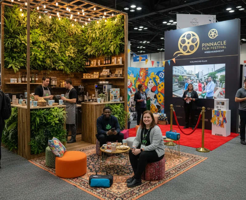
6. Nature-Inspired Design
Greenery, wood textures, and eco-friendly décor create a refreshing vibe that stands out on busy trade show floors. This theme works especially well for companies with sustainability initiatives or those targeting environmentally conscious consumers. Consider partnering with local plant vendors or incorporating living walls into your design. Sustainable giveaways perfectly complement eco-friendly booth designs and reinforce your environmental message.
Themed Giveaway Ideas:
- Reusable bamboo utensil sets with your logo
- Eco-friendly notebooks made from recycled materials
- Custom seed packets with planting instructions
7. Rustic Food Market
Turn your booth into a tasting station or mini café. Offer samples of local products, branded coffee, or themed snacks that connect to your industry. This approach creates a welcoming atmosphere and gives visitors a reason to linger and learn about your offerings.
Themed Giveaway Ideas:
8. Hollywood Glam
Roll out the red carpet with a movie-themed booth and photo opportunities. Create a VIP experience with velvet ropes, spotlights, and a step-and-repeat backdrop featuring your branding. This theme works well for companies launching new products or celebrating milestones.
Themed Giveaway Ideas:
- Sunglasses in trendy styles
- Custom popcorn boxes
- Branded tumblers with movie-themed designs
9. Festival Vibes
Coachella-inspired décor with music, lights, and laid-back style creates an energetic atmosphere. Set up lounge areas with comfortable seating, play upbeat music, and create Instagram-worthy moments. This theme appeals to younger demographics and creative industries.
Themed Giveaway Ideas:
- Branded bandanas with your logo
- Custom canvas tote bags in festival colors
- Portable Bluetooth speakers with logo
10. Charity Spotlight
Highlight a cause and connect with attendees on an emotional level. Partner with a local nonprofit, create donation opportunities, and showcase your company’s community involvement. This theme builds brand affinity while supporting meaningful causes.
Themed Giveaway Ideas:
- Custom awareness ribbons for the cause
- Branded wristbands with charity messaging
- Pins with donation information

Industry-Specific Trade Show Themes
These targeted themes work best when tailored to specific industries or professional audiences, creating immediate relevance and connection with your ideal prospects.
11. Healthcare & Wellness
Clean, calming booth design with wellness giveaways appeals to healthcare professionals and companies focused on employee wellbeing. Use white, blue, and green color schemes, incorporate plants, and create a peaceful environment that reflects your commitment to health.
Themed Giveaway Ideas:
12. Automotive Garage
Channel a racing garage or showroom feel with industrial design elements, checkered flags, and automotive imagery. This theme works perfectly for automotive suppliers, racing sponsors, or companies serving the transportation industry.
Themed Giveaway Ideas:
13. Consumer Tech Future
Showcase innovation with sleek, futuristic designs using metallic finishes, LED lighting, and modern furniture. Create a space that feels like stepping into tomorrow, perfect for tech companies and innovative brands.
Themed Giveaway Ideas:
14. Education & Learning
Set up a classroom-inspired space with study-friendly swag and educational materials. Create interactive learning stations, offer mini-workshops, or provide resources that add value for educators and students. College swag ideas work particularly well for educational themes, and our University of Swag collection offers perfect branded merchandise for schools and universities.
Themed Giveaway Ideas:
15. Finance & Banking
Create a sense of trust with a booth theme designed around security or money. Use professional color schemes, incorporate security imagery, and create an atmosphere that reflects reliability and expertise in financial services.
Themed Giveaway Ideas:

Creative & Fun Trade Show Themes
These playful themes work excellently for creative agencies, entertainment companies, consumer brands, and businesses targeting younger demographics or those looking to stand out with memorable experiences.
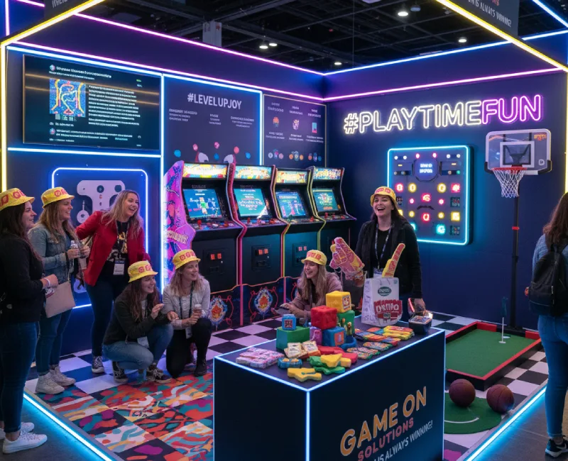
16. Retro Arcade
Bring nostalgia with arcade games and playful energy. Set up classic games, use neon colors and retro graphics, and create an atmosphere that appeals to multiple generations. This theme generates buzz and encourages social sharing.
Themed Giveaway Ideas:
- Branded stress cubes in bright colors
- Custom socks with retro patterns
- Logo-printed candy packs with nostalgic treats
17. Sports Stadium
Recreate game day energy with mini games and sports swag. Set up putting greens, basketball hoops, or other interactive sports activities. This theme works well for companies with sports partnerships or targeting active demographics.
Themed Giveaway Ideas:
- Branded sports water bottles
- Custom foam fingers with team branding
- Logo baseball caps
18. Travel Escape
Create an airport lounge or tropical getaway vibe with comfortable seating, travel imagery, and destination themes. This works well for travel companies, hotels, or businesses with international reach.
Themed Giveaway Ideas:
- Luggage tags for frequent travelers
- Branded passport holders
- Custom travel pillows
19. Wellness Retreat
Offer yoga demonstrations, massage chairs, or calming aromatherapy. Create a peaceful oasis on the busy trade show floor where visitors can relax and recharge while learning about your wellness-focused products or services.
Themed Giveaway Ideas:
20. DIY Workshop
Let attendees get hands-on with projects and branded tools. Set up crafting stations, offer mini-workshops, or provide materials for visitors to create something useful while learning about your company’s expertise.
Themed Giveaway Ideas:
- Custom work gloves
- Branded toolkits with essential items
- Measuring tapes

Brand-Centered Trade Show Themes
These themes put your company’s unique story, values, and offerings at the center of the experience, perfect for established brands looking to deepen connections with existing customers and attract new ones.
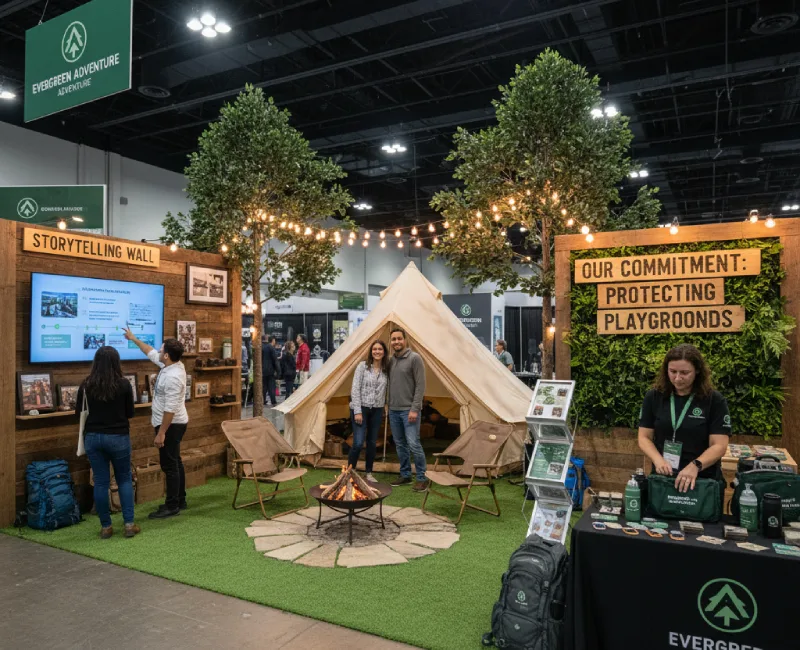
21. Product-Inspired World
Design your booth to mimic your product or service environment. If you sell outdoor gear, create a camping scene. If you provide software solutions, design a modern office space. This immersive approach helps visitors envision using your products.
Themed Giveaway Ideas:
- Custom desk organizers as branded accessories
- Branded paperweights with product designs
- Custom magnets featuring product graphics
22. Storytelling Wall
Showcase your brand’s journey with a visual timeline or interactive display. Include founder stories, company milestones, customer testimonials, and future vision statements. This theme builds trust and emotional connection with your audience.
Themed Giveaway Ideas:
- Branded spiral notebooks for capturing ideas
- Custom executive pens with inspirational messaging
- Photo holders featuring company milestones
23. Sustainable Brand Message
Reinforce eco values with recycled materials and earth-friendly décor. Use reclaimed wood, living plants, and sustainable signage materials. This theme appeals to environmentally conscious customers and demonstrates an authentic commitment to sustainability.
Themed Giveaway Ideas:
- Reusable drinkware made from recycled materials
- Organic cotton tote bags with eco messaging
- Custom plantable coasters with seeds
24. Heritage or Local Roots
Highlight your hometown pride or cultural roots with local imagery, regional products, and community connections. This theme works especially well for family-owned businesses or companies with strong local ties.
Themed Giveaway Ideas:
- Local-themed apparel featuring your city
- Branded mugs with skyline graphics
- Custom coasters with local landmarks
25. Future Vision
Highlight innovation and where your company is headed with forward-looking design elements, technology demonstrations, and visionary messaging. This theme shows where your brand is headed and how you’re growing with your industry.
Themed Giveaway Ideas:
- LED logo pens that light up
- Branded smart notebooks with digital connectivity
- Custom tech accessories with QR codes
Elevate Your Next Trade Show with Pinnacle Promotions
Creating a memorable trade show experience requires more than just a great theme. You need promotional products that reinforce your message and keep your brand top of mind long after the event ends. Pairing the right theme with strategic planning is key to measuring trade show effectiveness and maximizing your investment.
With over 30 years of experience helping companies make lasting impressions, Pinnacle Knows Promo, and that expertise shows in every custom product we create for trade show giveaways. Whether you’re planning a high-tech interactive experience or a simple, elegant brand showcase, we’ll help you find the perfect promotional products to complement your theme and maximize your ROI. From 24 Hour Rush service to custom designs, our dedicated account managers ensure your trade show materials arrive on time and exactly as you envision them.
Ready to make your next trade show booth unforgettable? Explore our trade show promotional products and discover items that perfectly match your chosen theme.
