Admin

Top 5 retail inspired drinkware products

Top 5 retail inspired drinkware products

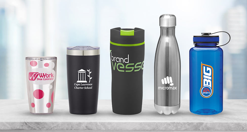
Consumers are demanding more and more out of their drinkware – more capacity! more quality! more features! Brands such as YETI, S’well, Thermos, Tervis, and Nalgene are prominent in the drinkware industry because they have mastered the needs of their consumers. Putting your logo on these retail brands is an investment – with all of the "more"s comes a higher price point – and for many, a worthwhile one. A branded YETI tumbler carries a high perceived value that is as much gift as it is marketing piece.

But not every company wants to spend brand-name money for brand-name products. For those companies on a budget, some of the manufacturers we work with have created more affordable versions with many of the features that consumers love about the retail brands. These are not cheap knock-offs, either – they're quality drinkware products made from quality materials that carry a cachet of their own. Here are five examples of promotional drinkware pieces that are comparable — if not better — than the name brands.

Himalayan vs. YETI Tumbler

The YETI brand has exploded into the market as a forever fan favorite for superior drinkware. The brand has not only become the leader in drinkware for the rugged/outdoor market — hunters and fisherman — but lately they've become known as a high-end luxury brand, while retaining their outdoorsy roots. A great alternative to the YETI is a customized Himalayan tumbler, which provides the copper vacuum insulation and stainless steel strength of a YETI, and is the perfect choice for both hot and cold beverages. The snap-on, spill-resistant thumb-slide lid is a great feature for people on-the-go. The fun colors that are offered in the powder coat finish are also reflective of YETI’s famous appearance. The Himalayan is the perfect quality piece of drinkware that will never disappoint.

The Himalayan Tumbler can be screenprinted, have a full color imprint, or be laser engraved with your logo. There's also an optional lid and straw so you can mix and match colors to match your brand.

Check out the Himalayan tumbler here >

h2go force vs. S’well

Unless you live under a rock, you have most likely seen a S’well bottle. Maybe you have one...or five. Why are people still hyped about this bottle? Maybe it's the easy-to-hold shape. Maybe it's the solid stainless steel insulating qualities. Maybe it's the wide variety of colors and patterns that are perfectly on-trend. Whatever the reason, people, and companies, think they're, um, S'well.

Our selected alternative, the h2go force, comes in iridescent colors that mimic the numerous colors and patterns of the S’well bottle. The h2go force is offered in a number of sizes – choose from 17 oz., 26 oz., or 34 oz. to fit your needs. Perhaps your customers want the smaller 17 oz. bottle so it fits into their purse or backpack but they want the 34 oz. bottle for camping trips to hold more beverage, whether that be water or wine (we won't judge).

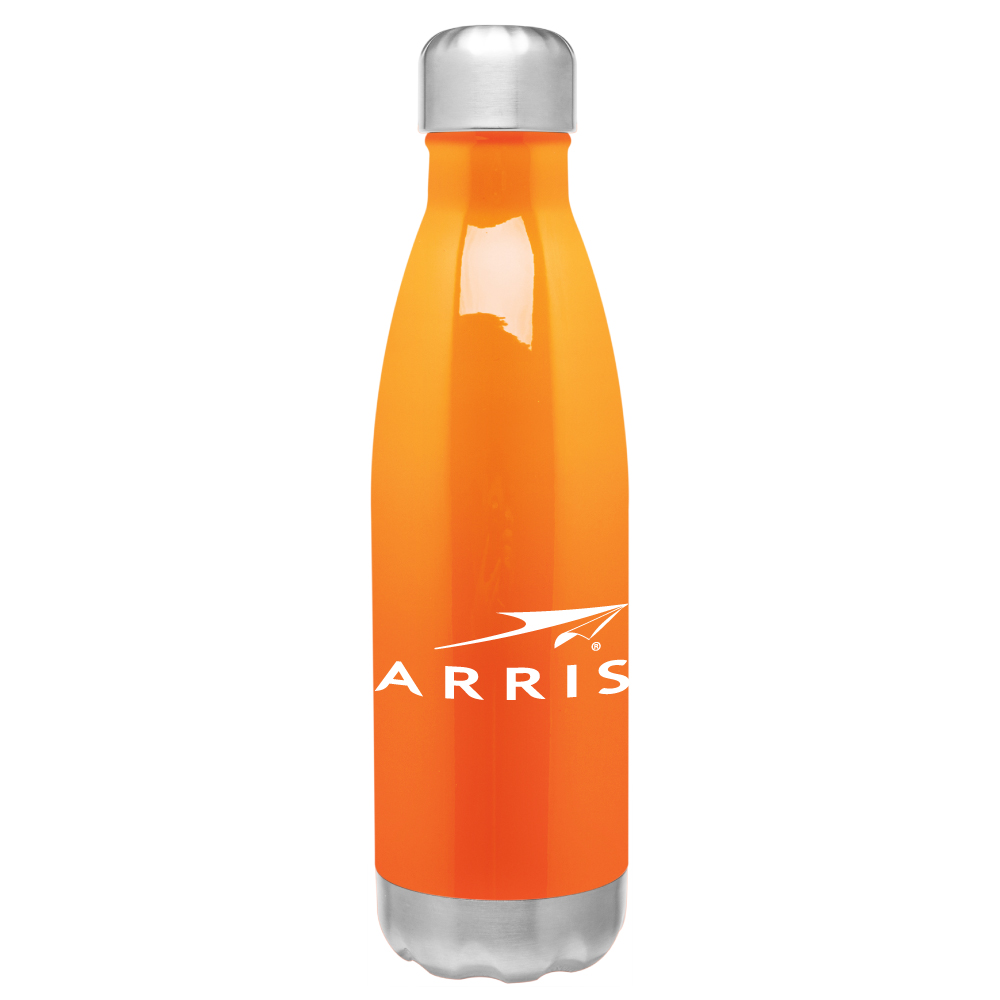
ARRIS Group Inc. provided these bottles as a gift to the interns at the end of the ARRIS Internship Program. They wanted a drinkware piece that was affordable, low minimum order quantity and a quick turn time. They were so pleased with the quality that of the item that a second order was placed only two months later.

Check out the h2go force tumbler here >

Punch vs. Contigo

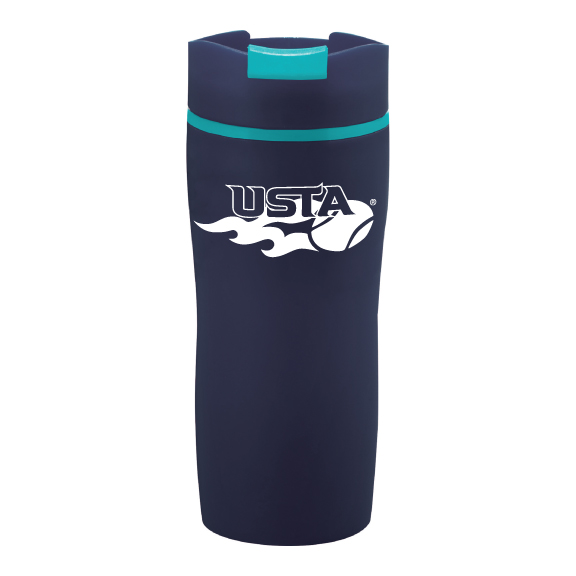
A huge player in the travel mug industry is of course, Contigo – simple, sleek, and spillproof. The Punch tumbler mimics the Contigo style and is perfect for the on-the-go fashion-forward consumer. The Punch tumbler is easy to hold and drink while also fitting perfectly into a cup holder. Whether you are an iced coffee person or if you prefer the traditional hot coffee in the mornings, the tumbler will keep your drink hot or cold with the double wall construction for insulation. Thanks to the snap-on sip through lid, no more worrying about spills on your lap! If you want to travel smart and in-style, the Punch tumbler is your cup of tea...or coffee!

Our tennis division, Netknacks, offered these travel tumblers on their website and they became a huge hit (get it??)! The customers loved being able to use them for a variety of reasons, whether it was the early morning match over the weekend or morning-commute coffee during the week.

Check out the Punch tumbler here >

Tritan vs. Tervis

Let’s face it – it isn’t easy to find a drinkware piece that's attractive to all ages, but the Tervis Tumbler is definitely an exception. Its impact- and shatter-resistance and double wall construction to hold and cold liquids makes it indestructible whether you are a child, teenager or adult! The customized Tritan tumbler is a perfect lower-priced alternative with its optional snap on lid and 9” straw, making it the perfect sippable giveaway. The Tritan tumbler is also known for the unique customization capabilities where the decoration is inserted in between the clear double walls of the tumbler and sealed to provide insulation. You can put your logo on an embroidered round patch, screenprint on a white or silver full wrap insert, or customize on an oval dome. This USA made product is a true American classic.

Check out the Tritan Tumbler here >

h2go wide vs. Nalgene

Whether consumers are planning a picnic, mountain climbing, cycling, or just need a new water bottle for their kid to use in grade school, Nalgene is the go-to pick because it is easy to handle. The promotional h2go wide tumbler offers the same lid retaining loop of a Nalgene for anyone who is on-the-go. For all the parents out there, this water bottle design is perfect for cleaning due to the wide neck so say goodbye to those terrible odors. And for all the non-adults out there, the h2go wide becomes a canvas to put your own personality on. This large and in-charge (34 ounces to be exact) drinkware piece is a great choice due to its convenience and durability. In fact, all 52 regions of Teach for America use the h2go wide for recruitment through the year. They are clearly experts in understanding their target market!

Check out the h2go wide tumbler here >

If you are looking to leave a lasting impression without breaking the bank, these promotional drinkware pieces are perfect giveaways and corporate gifts. These quality promotional items take all of the best features of popular name brand drinkware and deliver them in a more affordable way...everybody wins!

Check out all of our drinkware – name-brand and comparable alternatives – at pinnaclepromotions.com
Posted by Admin in Marketing Ideas, 0 comments
Top 5 t-shirt styles for Casual Fridays

Top 5 t-shirt styles for Casual Fridays

by Sarah Gricius, Merchandising Manager

It’s casual Friday at the office and you rummage through the closest trying to figure out which company branded t-shirt to wear until you realize your favorite one is in the dirty clothes….UGH! Guess you will have to wear that stiff and scratchy one that is bundled up in a ball at the bottom of the dresser. Don’t be that company that gives your employees “those” t-shirts they never want to wear. Give them the option to wear your logo proudly on a comfortable, great-looking t-shirt they will wear over and over again.

On PinnaclePromotions.com, we offer hundreds of different t-shirt styles, so how do you know which is the right one? Well, I've done all the hard work for you...you're welcome. Below I've detailed my Top Five Casual Friday T-Shirt Styles – each one is not only a personal fave of mine, but each style receives outstanding reviews from our customers. Make sure to ask for a sample from our team here at Pinnacle so you can experience them for yourselves.

1. Alternative Unisex Keeper Vintage Jersey

Alternative-Unisex-Keeper-Vintage-Jersey

check it out on PinnaclePromotions.com >

This shirt is hands-down my all time favorite and I would buy it in every color! To begin, Alternative is a retail brand known best for comfort, simplicity and its commitment to sustainability. The items produced by Alternative are specially washed which provides a soft texture that pre-shrinks them as well.

The Keeper Vintage Jersey is a 50% Cotton / 50% Polyester blend which offers stretch in the material. Blends are known for versatility and durability, they can maintain shape and the color of the shirt will not fade through several wash cycles. The 4.4 ounce weight of the shirt allows for a lighter and more breathable fit. I like to consider the Vintage Jersey as an "athleisure" piece in my wardrobe. When screenprinting on the shirt, I would suggest using a soft hand ink without a white underlay to match the soft texture of the shirt. This will prevent the logo from being stiff which is never a comfortable feeling.

Colors available: Black, Blue Sky, Maize, Navy, Red, Silver, Smoke Grey, Southern Orange, Vintage Coal, Vintage Iris, Vintage Navy, Vintage Pine, Vintage Royal, Vintage Stone, White

Sizes available: XS - 3XL, Unisex fit

2. Next Level CVC Crew

check it out on PinnaclePromotions.com >

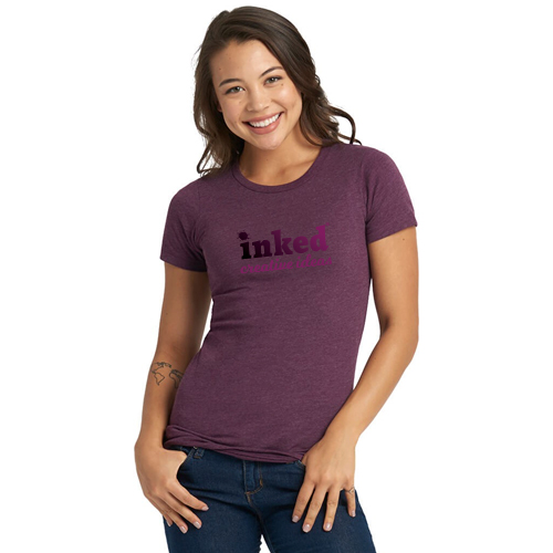
I own several of these tees and love to wear them as my Sunday lounge attire. What I refer to as the Champion of Casual but better known as the Next Level CVC, Chief Value Cotton, Crew is a Pinnacle pick throughout the office. The "CVC" in the name refers to a cotton and polyester blend with a heavier percentage of cotton. This tee has a make up of 60% cotton and 40% polyester, making for a great quality and budget-friendly t-shirt – a win all around. Polyester threads are strong and tend to have more stretch and memory compared to a Rayon thread. Rayon threads are relatively weak and often need to be dry cleaned therefore they have the tendency to shrink if not cared for properly.

Almost all colors in the this t-shirt feature a heathered look but it's most prominent in the gray color family. Another great feature is the tear-away customizable label so you can really brand every inch of the shirt. Print on the shirt AND the label for ultimate customization. The shirt is only 4.3 oz., so it may feel like a thin material, but from personal experience the quality and print holds up through several wash cycles.

Colors available: Apple Green, Banana Cream, Black, Bondi Blue, Cardinal, Charcoal, Cream, Dark Heather Grey, Espresso, Ice Blue, Indigo, Kelly Green, Light Olive, Midnight Navy, Military Green, Mint, Neon Heather, Neon Yellow, Orange, Purple Rush, Red, Royal, Sand, Silk, Stone Gray, Storm, Tahiti Blue, Turquoise, Warm Gray, White

Sizes available: XS-2XL, also available in Men's style

3. ComfortWash by Hanes 5.5 oz. 100% Ringspun Cotton Garment Dyed T-shirt

check it out at PinnaclePromotions.com >

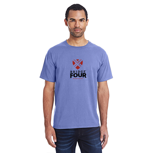
My Hanes were all over this shirt when I received my first sample in the Deep Forte (medium purplish-blue) color. I was in complete shock when I first saw the brand of the t-shirt – I usually think of Hanes as the cost-effective brand that is great to buy for value, but the ComfortWash tee from Hanes has the softness of a blanket. It's made with American grown cotton and enzyme washed which gives it the ultra soft feel. With the Hanes ComfortWash, I don’t have to sacrifice softness to get the look I love. This tee definitely keeps my skin smiling!

Colors available: Anchor Slate, Black, Concrete, Coral Craze, Crimson Fall, Cypress Green, Deep Forte, Mint, Navy, New Railroad, Purple Pim Raisin, Soothing Blue, Summer Sky, Summer Squash, White

Sizes available: S-3XL

4. Threadfast Apparel Unisex Triblend Short-Sleeve T-shirt

check it out at PinnaclePromotions.com >

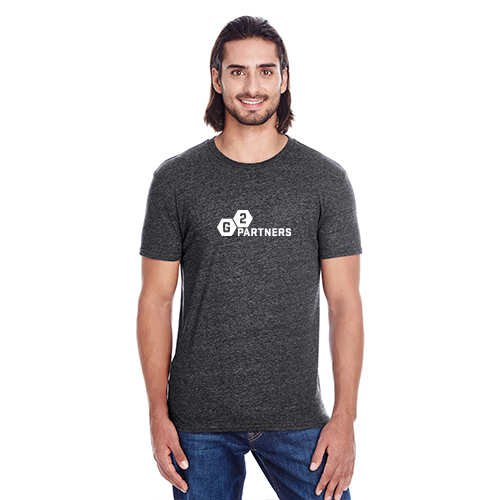
Heathered, or what I like to call weathered, shirts are a trendy take on casual wear that I hope never goes out of style. The marbled appearance of the fabric provides a visual interest on an otherwise simple piece of apparel. The Threadfast Jersey Short Sleeve T-shirt is retail inspired and the smooth surface of the tee is ideal for screenprinting. I would suggest a simple one color imprint on this tee since there is already a natural marbled background. This tee consists of 95% polyester and 5% cotton so it can easily be considered a top pick for the sportswear industry as well. I like to wear my Threadfast tee when I take my dog out for walks or if I plan on spending a day outside at the park.

Colors available: Black Triblend, Cardinal Black Triblend, Cream Triblend, Green Triblend, Grey Triblend, Mint Triblend, Navy Triblend, Orange Triblend, Red Triblend, Royal Black Triblend, Royal Triblend

Sizes available: S-2XL, Unisex fit

5. District Made Scorecard Tee / Game Day Tee

check it out at PinnaclePromotions.com >

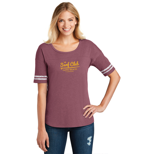
The District Made Scorecard Tee (mens version is called the Gameday Tee) adds just the right flair to the basic tee. This tee screams retro game-day with the distressed printed stripes on the sleeves! It is one of my favorites because it brings me back to the University days where I loved sporting my school spirit! As a company, you can bring that spirit to life with your company logo printed on this tee, and the Game Tee gives you a chance to have fun with your logo and retro-fy it. Remember, what was old will become new again.

The 4.5 oz. weight of the shirt is right in the sweet spot: not too heavy and not too light which makes it the perfect tee to wear outside! The build up is another 60% cotton and 40% polyester blend and features a tear-away label. With the vintage look and great quality material, this tee will score year 'round.

Colors available: Heathered Charcoal and White, Heathered Nickel and White, Heathered True Navy and White, Heather True Royal and White

Sizes available: XS-4XL, also available in Men's style (Gameday Tee)

Conclusion

There are hundreds of different t-shirt styles to put your logo on, and although this post only highlighted my 5 top styles, it is a great starting point for your next project. At Pinnacle, we pride ourselves on being experts in the products we offer – you can trust that any one of these styles will be a great quality t-shirt to Make the Right Impression on your employees and customers.


Posted by Admin in Marketing Ideas, 0 comments
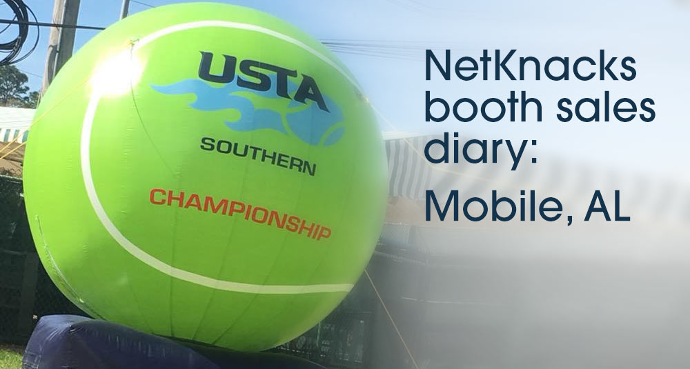
NetKnacks Booth Sales Diary: USTA Southern Sectional Championships, Mobile, AL

NetKnacks Booth Sales Diary: USTA Southern Sectional Championships, Mobile, AL

March 9-11, 2018

by Darlene Jefferson, Program Director, NetKnacks Tennis Awards

NetKnacks is all about spreading the love of tennis, and one of the most rewarding things I get to do for NetKnacks is spread that tennis love at USTA Sectional Championship Events. Players have worked really hard to earn their spots at these events and get one step closer to a National Championship.

At these events, NetKnacks sells USTA Sectional Championship attire and other imprinted items so each player can commemorate this special event. We just attended the USTA Southern Sectional Championships in Mobile, AL, where there were over 1200 players from across the southern region – Adult, 18 & Over, & 40 & Over, Men’s & Women’s – and I can’t say enough about how excited they were to see us in attendance.

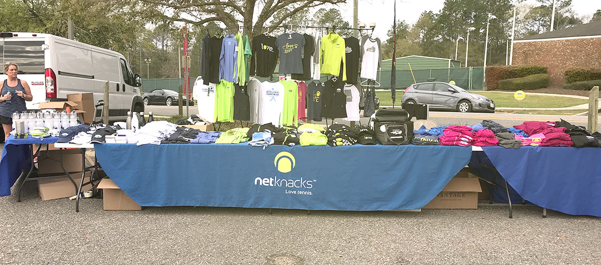
Southern is one of the best-attended events for our booth sales program, and preparation was an adventure. The day before the event, we drove from Atlanta to Mobile in the largest cargo van I have ever driven in my life, completely filled to the brim with our booth and all of the tennis promotional products we could stuff into it. Luckily, we made it in one piece. As we do before every booth sale, we went to the site to stake out the best spot. We always try to choose a location where everyone has to pass our booth – of course they'll love what they see, so they'll stop by!! The Mobile Tennis Center folks were the perfect hosts and let us set up in the front of the parking lot, at the entrance to the tennis center and right by the food trucks where everyone would be getting their lunch throughout the day (mmmm...food trucks…).

We arrived very early – in the dark (5:30 AM to be exact) – the Friday of the event, since players begin to show up at 7:30 AM and we knew we needed to be ready. We start out every booth set-up by putting out our product options on our three tables and our amazing hanging rack so everyone can see all the apparel options, just like at a rock concert merch stand. And we sure did feel like rockstars. Within 15 minutes of being open, the players took over the booth and we were non-stop ringing up sales with long lines of people waiting to purchase. We kept busy until we closed the booth that day at 5:00 PM. We reorganized, packed up and went directly to bed exhausted from a very successful booth day. And then we did it again. And again. We repeated this process for two more days until the event ended and we were almost completely sold out!

I drove the very large – and empty – van back to Atlanta on Sunday afternoon thrilled with the results of the weekend. Everyone wanted their own special item to bring home to show that they made it to this championship event. Some players even came back several times over the weekend – some could not decide on just one item, and some decided to purchase some of our items as gifts to use throughout the year.

We are constantly bringing new products to the booths and only bring the best quality so that our players will love them and use them over and over again. For USTA Southern, the merchandise we selected included practical drinkware and apparel options as well as fun items like our wine sippy cup, our LOVE Koozie, and our LOVE Net Check. Practical items include Nike Hats and Visors, Tennis Attire, Pullovers, Jackets, Tennis Towels, Coolers, Grips & Drinkware. In Mobile, we sold out of our wine sippy cups within the first hour of being open, a record for us!! I guess Alabamians are thirsty.

NetKnacks primarily sells our items via our online store (netknacks.com), so it is a real treat to see personal reactions of how actual players receive our products. We also learn from them when they give us new product ideas to add to our offering. We meet with our suppliers on a monthly basis throughout the year to see what is new and exciting in the market and what item is the current craze (i.e. fidget spinners) so you never know what you will see at our next booth!

This is just the beginning of a great 2018 tennis season and we look forward to attending sectionals all over the United States in the upcoming months!! Next stop, USTA Southwest in Tucson, Arizona – here we come! I don't think I'll be driving the van for this one.

Posted by Admin in Case Studies, Marketing Ideas, Promotional Products Around Town, 0 comments
The paradox of overchoice: how many options are too many?

The paradox of overchoice: how many options are too many?

by Dave Weintraub, CEO

Luckily, I do not go to the grocery store very often.

When I do go, I usually spend three times what I was planning on spending and often I forget what I was originally supposed to buy and have to go back. Recently, I came home from work one night, and my wife asked me to go to our local Publix to get pasta sauce. “No problem” I replied, grabbed my keys and headed down the street thinking it would be a quick in and out.

Wow, was I wrong. How hard can it be to buy a jar of sauce at a grocery store? How about 45 minutes hard.


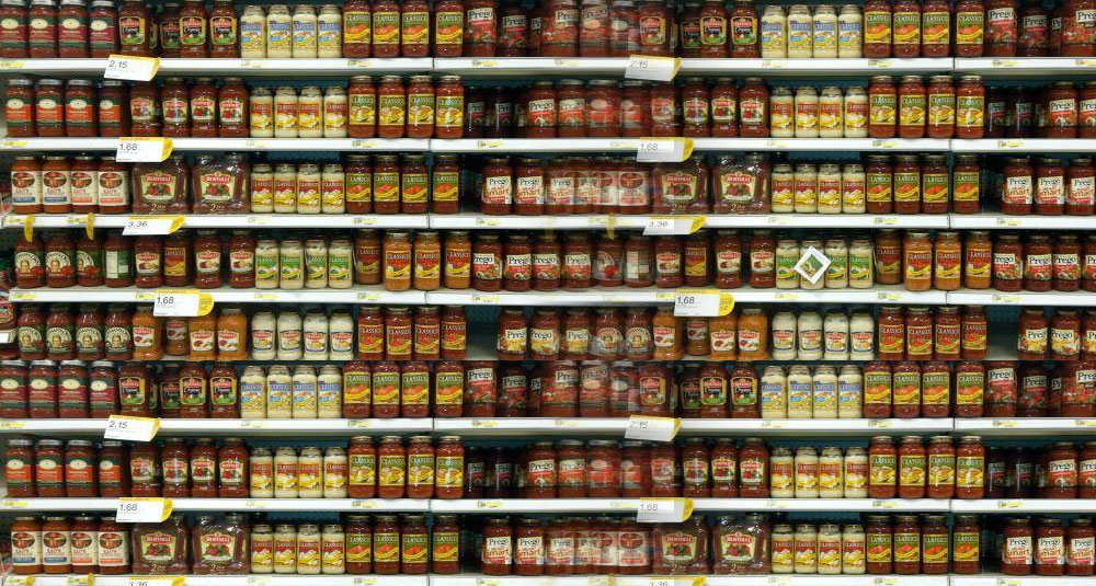
Jars and jars and jars....

I walked into the store and immediately headed for the pasta aisle. Prego. That was the name stuck in my head. My thought was to walk right over, grab the first jar I see and then head straight to the express checkout. I couldn’t have been more wrong.

First, Prego has about 35 different kinds of sauce. You have to make a choice. Do you want a Favorite, a Classic Italian, or a Premium? What about a Prego Farmer’s Market version with organic ingredients? There was traditional, tomato basil with garlic, fresh mushroom, homestyle, meat-flavored. Seriously!? I was absolutely overwhelmed...and that was just one brand. There’s also Newman’s Own, Bertoli, Ragu, Barilla, and the private-label Publix versions of all of these. With all of the combinations, there had to be at least a hundred different options staring back at me.

"This is what you want."

I was just standing there staring at the shelves for 10 minutes when the stockperson came up to me and asked me if I needed help. “I don’t know” was all I could say. The reality of the situation was that I was actually scared to choose something because I knew that if I came home with the wrong jar my wife would just send me back out again.

The stockperson and I went back and forth for another 10 minutes. Did I want garlic? Vegetarian or meat? Peppers and onions? My head was spinning until suddenly I heard a familiar voice, “What are you doing?” Thankfully, it was my wife’s best friend. She lives down the street and happened to be shopping. After begging her not to tell, I explained my predicament. She laughed, reached over my shoulder, grabbed a jar, and said “This is what you want”. I took it, said thanks, and ran.

Overchoice defined

In the car on the way home I started to wonder what just happened. I don’t usually have a tough time making decisions, but this was different. It wasn’t that there was a right or wrong decision to make – I would imagine that all of the sauces pretty much taste the same. The question is, what do you do when you have to make a decision between items that all seem the same?

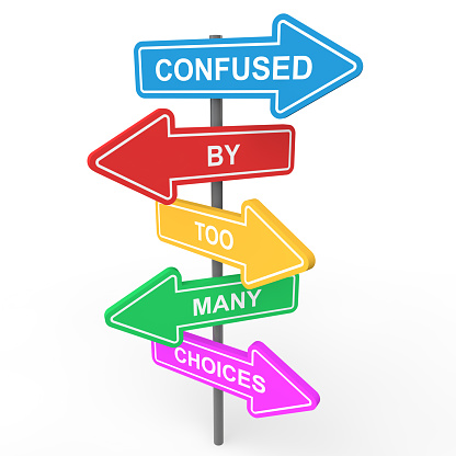
That is the paradox of choice…or what psychologists call the phenomenon of “Overchoice”. The simple definition is that people have a difficult time making a decision when faced with too many equivalent choices. The process was first named and written about in 1970, but there have been numerous studies since then that document the struggles of choice.

We’re all faced with this every day from college options, to career options, to romantic relationships. Modern technology makes our increased options even greater, with easy access to information. We’ve all been there. When was the last time you went to Amazon with the intent to buy something you were certain about and ended up leaving the site with nothing? It happens to the best of us. We read the reviews, look at “similar” products and then just get frustrated and overwhelmed and can’t bring ourselves to press 1-click to order.

How many choices are too many?

A few years ago researchers put together a study to gauge just how many choices are too many. They went to a grocery store and put out six jars of jelly. Forty percent of the shoppers stopped to take a look at the selection and a whopping 30% actually purchased something. The next week the researchers put out 24 varieties of Jelly. Just as you would expect, it attracted more people! Sixty percent of the people stopped to take a look at the layout – a huge number. But, surprisingly, only three percent of the shoppers actually bought something.

The researchers concluded that having such a large number of equally good options is too mentally draining because each option has to be weighed against the others. Initially, more choices leads to more satisfaction, but as the number increases, it peaks and then people tend to feel more confusion, pressure, and potential dissatisfaction. A smaller number of choices leads to increased satisfaction and less regret. The pressure of choice is even more extreme when you add in limited-time constraints.

The solution: how to overcome overchoice

My sauce-choosing experience was just a small example of what a typical consumer is faced with during the day, but I also see it a lot at work. At Pinnacle Promotions, we sell imprinted promotional products and corporate apparel. As a distributor, the choice options are almost endless. We literally have access to about 700,000 different products on which a company can print its logo.

We have a phenomenal website with hundreds of categories, tens of thousands of products and a multitude of imprint methods. But what do you do as a client when your boss tells you to find products that you can give away at a trade show? It can be simply overwhelming. You can go to 10 different websites and everything looks the same – Overchoice in all of its glory.

Here’s the thing, though. My wife’s friend knew what I wanted because she knows me and my family. She spends enough time with us to know what would satisfy our needs, fit in our budget, and make me look good. This is how you overcome the Overchoice dilemma – with individuals who understand what you are looking for, know the questions to ask, and people that you can trust to help narrow down your choices to a manageable level.

And that's exactly what we do at Pinnacle – we train our staff to be product experts so that they can help you find exactly what you need at the right price.

The stockperson at Publix was there to help, but he didn’t really know what I wanted, so his suggestions only made me more confused. It took someone who had a relationship with me and my family to get me where I needed to go. Easy access to products and information can give you more choice, but is it the right choice?

My suggestion: make choices easier in your business life and surround yourself with partners, vendors, and suppliers that take the time to learn what your business is all about and learn about you as a human being, not just a potential sale.


Dave Weintraub started Pinnacle Promotions with his brother Mitch in 1994. In the ensuing years, he's seen the options for branded merchandise – and the access to those options – expand dramatically. His goal with Pinnacle is, and has always been, to take all of these options and narrow them down to just the right ones.


Posted by Admin in Marketing Ideas, 0 comments
5 super-important visual merchandising tips to design a product showroom

5 super-important visual merchandising tips to design a product showroom

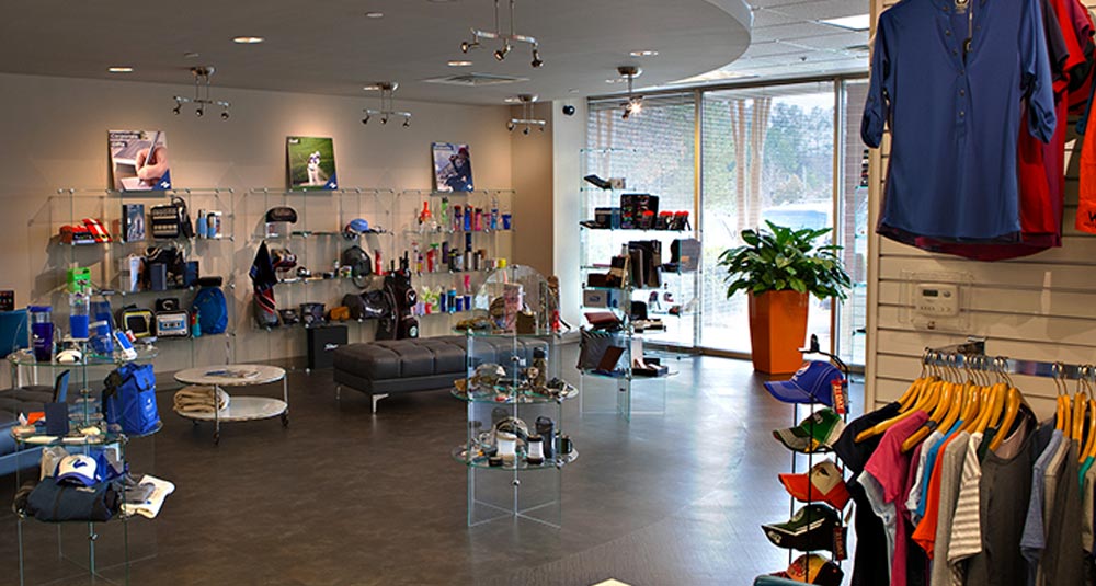
When you walk into many businesses, you see photos or displays that tell a story about the company. As a promotional products company, our story is products: we sell thousands of different products across a broad spectrum of product categories. Rather than jamming as many products as possible onto shelves to show that broad spectrum, though, we strive to present a retail experience.

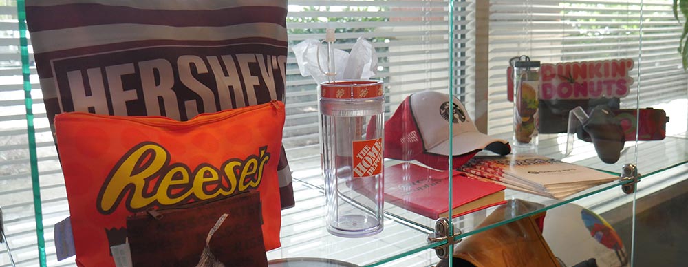
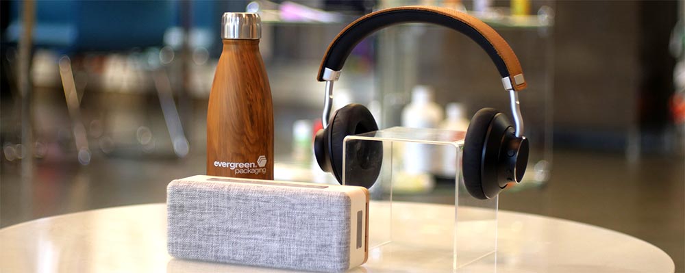
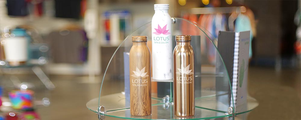
Our showroom at Pinnacle Promotions displays a tidy collection of product groups that highlight items we can customize. These products aren’t arranged that way by accident – they are visually merchandised with intention to help the products sell themselves.

While our business is primarily online, our office does get foot traffic – many of our larger clients visit for regular check-ins, and we bring prospects through to see the breadth of our promotional agency. It's important that our showroom effectively presents the products we sell to help our customers (and our employees) understand their uses and intentions, just like a retail showroom would.

Good merchandising drives traffic to your business (think window shopping) and influences customers to purchase once they're inside. Merchandising can have a positive impact on sales by providing a memorable experience. Customers are more likely to return in the future if they find a business that is well organized and attractive. According to the article, Why Visual Merchandising Matters More Than Ever, 65% of individuals say they are visual learners and visuals increase message retention by 42%. Therefore, visual merchandising combines both a creative and scientific aspect to help get the message across faster with more impact.

Not really sure how to get started with visual merchandising for your business? The following five actions will help you create an effective visual merchandise display to catch your customer’s attention and get them to spend money with you!

1. Define your target customer

We all respond differently to different messages, and those differences are generally affected by our age, income, and education level. Diving deeper, you can look at buying behaviors and psychographics – values, opinions, attitudes, and interests. Knowing more about your target customers' lifestyles will help determine your displays' product selections, layouts, and messages.

This may seem obvious – if your customers are predominantly women, you'll want to display items that will appeal more to women – but it goes beyond the surface demographics. If your research determines that your target customers tend to be interested in music, you would be wise to pepper your displays with music-themed products, even if you're not selling music products. The more you can hit your customers' hot buttons, the more effective your displays will be.

2. Group like items together

promotional product themes | Pinnacle Promotions

Product bundling will offer an easy shopping experience for your customers. Grouping products together will entice the customer to purchase more – we're all about convenience. Product grouping can be based on any attribute: start with theme, color, type, or size, and let your mind go from there. Just think of the layout at your local grocery store: the bread is right next to the peanut butter and jelly and the lunch meat is right next to the cheese.

At Pinnacle Promotions, we base our displays around themes. Using themes gives our customers a better understanding of how to use the products while making the experience more interesting. Our showroom currently displays the following themes:

Spring Fever
These products incorporate the pastel colors of spring to highlight seasonal trends.

Rugged Outdoors
These products are inspired by the great outdoors which will motivate you to get outside with products designed to perform.

On-the-go Tech
These products have an elegant design to help you stay organized, light on your feet, moving at the speed of sound, and help navigate your busy lifestyle.

Retro Style
These nostalgia and vintage-inspired items are making a comeback as they trigger a happy feeling of the past. In an era of #ThrowbackThursday and #FlashbackFriday, retro products are becoming a trend again!

Natural Serenity
These products have a timeless quality that allow you to escape reality with materials and styles taken from nature.

Global Community
These products feature unique patterns borrowed from around the world. They merge the best of our ancestry with today’s modern aesthetic for one of kind pop of pattern that is designed to bring you to a whole new world of style.

Corporate Premiums
These unique and high-end products can make a great impact on customers or employees as a way to leave a lasting impression.

3. Follow the Rule of Three

Rule of three | Pinnacle Promotions

A principle that most visual merchandisers abide by is the Rule of Three. When creating a display, try to work in sets of three instead of having items side by side. Displaying products in groups of three provides visual interest – the eyes always have something to focus on and continue to jump from product to product. This concept derives from the Pyramid Principle, which suggests that displays should have a triangular (pyramid) shape. The largest item is placed at the top center and the smaller items are on the outside, creating a step down from the focal point. The principle allows for variety in the surface so displays do not feel flat. The article by Barbara Wright, Principle #3: Pyramid Power, gives some great examples of how to use the principle with glasses displays.  

This method is also employed in writing, economics, film, photography, and many other disciplines. Here are some tips when using the Rule of Three for merchandising:

  • Choose closely related products
  • Experiment! Try moving around the products to show different angles
  • Make these products the focal point of your display

4. Refresh your displays

Customers like to see new and unique products when they return to a store, and it falls on the visual merchandiser to create innovative ways to display the products. Maintaining the same displays over time will produce a stagnant environment and discourage repeat customers, while constantly refreshing displays will create interest and enable merchandisers to show more of the breadth of available products.

Additionally, refreshing a display can help the visual merchandiser experiment and help with identifying what really makes the brand stand out. Try it, measure it, adjust it, repeat... Learn from what worked previously and grow from that knowledge!

5. Keep brand consistency

The consistency of visual branding and messaging throughout a store strengthens your brand identity and creates a positive sentiment for your company. When a brand shows consistent messaging, customers will feel that your brand is more dependable. Imagine going to a retail store where everything is well organized and the customer service is remarkable but when you return two weeks later, the sales reps are flinging clothes around and not being attentive. You would get mixed messages and wonder who and what the store is really about. It works the same way when merchandising a showroom; if you maintain consistency through your brand, customers will have the feeling that they can trust you.

At Pinnacle Promotions, our reputation is built on ensuring brand consistency for our clients...and for ourselves. From the people that work here to the products we sell we all have understanding of how to Make the right impression.™

So, in conclusion...

Creating the perfect product display requires a number of factors to take into account. First, know who your customers are...and what they want. Group your products together by whatever method makes sense for your business. Try the Rule of Three. Keep your displays fresh and new. And be consistent with your messaging.

Experiment with these techniques and keep your eyes open to new trends so you can continue to add to your merchandising knowledge. It is important to track what works and constantly adapt based on the needs of your target customer. Now, armed with these visual merchandising tips, go forth and see how much you can increase sales with effective product displays!

Posted by Admin in Marketing Ideas, 1 comment
How To Make a Good Logo with Examples

How To Make a Good Logo with Examples

I have been designing logos since I was about 5 years old. As a good Canadian boy, I would try to copy the NHL hockey logos, and later the NFL logos to the point where, through sheer repetition, I could draw them all by heart. The big red “C” of my hometown Montreal Canadiens, the spoked “B” of the evil Boston Bruins, and that big awesome Nordic horn on the purple Minnesota Vikings helmet. Even then, I had a feeling that some were better designs than others…but why? What makes a “successful” logo? How do you define its success?

I remember enjoying learning if a logo had a symbolic meaning to the city they belonged to. When I drew the Detroit Red Wings logo, I liked it even more when my dad told me that the car tire in the logo represented the city’s automotive industry.

A company’s logo shouldn’t be that different from a sports one. It should instill confidence, be very recognizable, and elicit pride and loyalty — for employees and clients alike. It should also look cool on a t-shirt. I think there are a few simple criteria, that if met, will result in a logo that can be defined as “successful.” Of course this is all just my opinion — but I have formed this opinion over (gasp) about 40 years of observation.

Where to start

Below are some common approaches (and examples) for designing a logo.

a. The name

There are levels of “obviousness” when it comes to brand recognition. The simplest, most obvious is if the logo is just the name in a stylized font or design. This can be a very clean and effective method. It doesn’t rely on a symbol, the wordmark is the symbol. Take the logos of IBM or Coca-Cola, for example. It’s just their names, but in completely original, instantly recognizable letter forms. Think Metallica, KISS, and the Beatles.

b. The symbol

One step over from that is the name with a symbol. The Apple logo is an apple, Burger King shows a burger, Domino’sTargetPuma… A symbol of the name of the company should be considered quite obvious. Your company name is “Cardinal Software” and your symbol is…a cardinal. You get it. Other people will, too. Trying to be original about the design is where your skill and imagination come in. Good luck, Batman.

c. The first letter(s)

This is still pretty obvious. “What’s his name, again?.. It starts with a “P””. It helps tie down the association of your company’s name to its most obvious symbol: the company name’s first letter. It ain’t genius – but it can be effective. Your company starts with a letter “P” so your logo is a letter “P”. That’s what I did for Pinnacle Promotions and NetKnacks tennis awards. Superman is a strong subscriber to this approach.

d. The unrelated symbol

A great coup is to get your brand known for a symbol that has nothing to do with the name and doesn’t involve the word or letters. It is purely an associated mark. The NBC peacock and Pepsi (swirly ball thing) are pretty good examples, but I think Nike and the Rolling Stones own this one. Swoosh.

Achieve logo greatness

Now that several approaches have been covered to get started, here are 5 checkbox-able elements that I believe can help steer you toward achieving logo greatness.

1. Keep it simple

KISS – “Keep it simple, stupid” is a cliché for a reason. And I think it was coined by a logo designer. The genius of many logos lies in their simplicity. If you ask any random person to draw the McDonald’s logo, there’s a good chance they can sketch the golden arches. This is called brand recognition. Also, no matter how complex the logo, it should still work when represented in black and white. Try to avoid drop shadows, effects and anything that makes your logo what I call “fussy”. Just take a look at the big kids, like AmazonWalmartMercedes, etc. They spend millions on branding and advertising, but all of their logos are very simple.

A very quick aside: rules are meant to be broken. I’ve seen many breweries, for example, with logos featuring detailed, retro, hand-drawn details, like Creature Comforts from Athens, GA, for example. They look great on a t-shirt or a beer tap, and I admire their complexity (look for a future blog post on this, specifically), but it’s still a good idea to have a simplified version because…

2. Make it scalable

This ties in to “simple”, but deserves its own category because of its importance. Keeping a logo simple is a design decision — making it scalable is an exercise in practicality. Having worked in the promotional products industry for many years has allowed me the opportunity to see thousands of logos, and many of these logos, although great, will absolutely not work when imprinted on a pen. The logo designer did not have the foresight to realize their logo might be used at ⅛ of an inch. Thin lines, tiny fonts, and fussy details are all to be avoided for this reason.

3. Easy on the color

Like “scalable”, “color” could also roll up under the “simple” category. Most designers know that color usually comes after design – I said it before, but no matter how complex the logo, it should still work in black and white.

A whole essay could be written about color and what it can mean for your logo and brand. And many have. Red is aggressive, blue is peaceful, yellow is friendly, blah blah blah. I won’t get into those details because some of the color “feeling facts” go against what I think is just as important: originality. I’ve designed a logo that features the owner’s college football team colors (Go Tigers!) I once chose orange simply because several competitors were blue. Ask the stakeholder and go with your gut.

Whatever your feelings about specific colors, simplicity of color is often the best way to go. Secondary colors, whether they are in the logo itself, or part of the supporting branding elements, can be tweaked over time. Also, there are times when your logo will need to be used as a single color, like white on a colored shirt. Fewer colors can mean less cost. That aforementioned NBC peacock is great, but I’m sure many people have slapped their foreheads when it comes to using it (and paying for it) as a 7 color screen print on a polo shirt. There will also be times when using several colors isn’t even an option, like a one-color pad print on the side of a pen. Trust me on this one. One, or two colors, max.

4. Be original

When designing anything – logos especially – it’s good practice to stay up with trends, so that you can avoid them. If you have studied logos over the years, you can often see where they fit on a timeline. Heavy drop shadows, skeuomorphic design (designer-geek word of the day! It refers to a design style that attempts to be as “realistic” as possible: three-dimensional shading, shadows, etc.), swirling elliptical shapes, the overlapping of multiplied colors, and single line icons all tend to date logos. It might look super cool this year, but will it be as good in five?.. ten? Beware of jumping on a bandwagon.

A side effect of trying hard to be original is that sometimes you are not as original as you thought! I have poured many hours into designing a logo just to have Dean in Accounting say “that looks just like the [another company] logo!” Being a successful designer means you have to develop thick skin. Of course you want to shoot back and say “no, it doesn’t” or “at least I’m not an accountant, Dean-o.” But you can’t. And you shouldn’t. This kind of feedback, although painful (and sometimes downright wrong) is valuable. Take the critique seriously. Ask other people what they think. Even point out the comparison – whether you like it or not, it might be true. Like with music, there’s always another melody. And almost every time, I’ve been happier with the result after going back to the drawing board. Because part of me knew Dean was right.

5. Be clever

This is the fun part. This is where, if you can check off the previous elements, you can flex your logo-designing muscles. This separates the designers from the truly gifted designers. It is not necessary to have an element of clever, but it is very rewarding to get the extra points. Everyone seems to know about the FedEx arrow in the negative (white) space between the “E” and the “x”. Once seen, it cannot be unseen. Sure, it’s a bit of a happy accident, but it was tweaked to be absolutely, positively, intentional. This negative space in a logo can often be where clever lives. Every logo designer looks for it, and hopes to find it there.

I have designed many logos, and I have to admit, I almost always try to get these extra clever points. The thing to be careful of, though, is that it shouldn’t come at the expense of the design itself. Sure, you have a super clever idea of how to sneak some element of the company into one of the letters of the logo. But if you can’t make it look good, it’s not worth it. If it’s too small, it’s not worth it. It has to come in last place, because it is, ultimately, unnecessary.

Your turn

I’ve often thought that logo design is perhaps the purest of all the corporate arts. Maybe it goes back to the hieroglyphs. You are trying to cram the essence of an entire company into one little nugget. And making it simple, scalable, original, memorable, and maybe even a little clever, is a challenge that many designers attempt, but very few truly excel in.

There’s a very helpful Picasso-influenced phrase I often use as a retort to clients or friends who might say “that’s what you came up with for a logo? It’s so simple. It must have taken you, like, 5 minutes to do that.”

“Actually, it took me 40 years to do that.”

As a designer, it is quite something to be able to look at a company’s logo and say “I did that.” It will (hopefully) be used for years on letterhead, the website, branded apparel, business cards, promotional products, videos – and maybe even on the front door you walk through every day.

Posted by Admin in Brand Identity and Corporate Logos, 2 comments
Why do recipients keep promotional products? (Top 5 Reasons)

Why do recipients keep promotional products? (Top 5 Reasons)

Have you ever considered the reasons why people actually own promotional products? Of course, many organizations hand out promotional products during events, and there's the occasional instance of accidental pen thievery, but what are the motivations for hanging on to these giveaways? Gaining insight to why people opt to keep your custom pens, branded polo shirts, and logoed tumblers can help you choose the most effective promotional items for your company to invest in, increasing the likelihood of impressions, brand interest, and cause awareness.

In a consumer study conducted by Promotional Products Association International (PPAI), over 1,000 individuals were surveyed on the reasons they chose to keep a promotional item. Of the top 10 reasons listed in the study, here are the top 5 that we feel are most important to our customers:

#5: Symbolism

17% of people surveyed keep promotional products because the item represents a cause they align with. While many organizations build brand and cause awareness through fundraising with inexpensive, high-quality promotional products, these items also make great giveaways at local events, as well as symbolic keepsakes for community volunteers and donor appreciation!

Non-Profit Organizations and other Associations participate largely in symbolism because of the affordability aspects, as well as the reach of cause awareness through passionate supporters and advocates.

Made in the USA Tumbler

Wooden Cube Blossom Kit

Cinema Light Box

#4: Loyalty

22% of people keep promotional products because they support the brandWhen consumers like the company's products or services offered, or when they’ve had an exceptional experience with a company, they talk about it. Receiving a promotional product from a brand they’re loyal to generates more positive referrals from devoted customers.

Here at the office, we wear and carry a LOT of Pinnacle Promotions branded promotional items! Shameless plug, yes, but aside from what WE like, it’s common to see promotional items being carried by local gym members, college alumni, hipster Apple fanatics and so many other loyal consumers! Brand loyalty sometimes extends to the brand of the product itself. If your brand is less well known, consider investing in name brand promotional products like Nike or YETI, customized with your logo, as an opportunity to increase brand awareness. Your customers' loyalty to the manufacturer can be shared with your company, giving your brand an added boost.

OGIO Shuttle Pack

Corkcicle Tumbler - 16 oz.

PopSocket Phone Grip

#3: Experience

28% of people keep promotional products because they have memorable value! Consumers are everywhere participating in everything from local community events to national conventions and festivals. In recent years, it has become an expectation of consumers to be reached at a personal level and there is no better way to create a resounding connection at these events than with a promotional item!

This is evident if you’ve ever seen an authentic Woodstock t-shirt, or a bag from SXSW, or a button pin from HOW Design Live, or a can cooler from the local arts festival down the street. People keep things that remind them of an awesome learning experience or an amazing time they had and if your company is participating in any type of similar event, you’ll want to show up with custom promotional items in hand!

Burlap Little Buddy with Neoprene Pocket

Sport-Tek Heather-On-Heather Contender Tee

Degas Full Color Tote Bag

#2: Design

43% of people keep promotional products because they fit their style or personality. Show of hands, who hasn’t seen a neon chartreuse or chevron printed, anything?! To help customize niche marketing campaigns, it’s imperative to keep up with industry and retail trends. Trendy promotional items attract people to your brand through colors, textures, patterns and construction! If there is something out there that speaks to your clientele specifically, it can, in most cases, be made into a promotional item.

Poppi Glass Tumbler - 20 oz.

Marbled Notebook

Allen Wood Tone Sunglasses

#1: Functionality

The number one reason that people hang on to promotional items is for functional purposes. In fact, 85% of people own promotional products because they’re functional! We can venture to say that a majority of people enjoy products that serve multiple purposes or make their lives a little easier. No matter what your business is, no matter how big, or how small, a promotional product that is also functional will always be a successful option for gaining impressions, brand interest or cause awareness.

Multi USB Cable Key Chain

PowerStick Click+ Smart Button

5" x 7" Journal Notebook

Your company can use these promotional product buying reasons to create connections that resonate with your existing clients, potential clients, and employees. Promotional products help your brand stand out from the competition and establish a solution for your brand’s offline marketing challenges. With the benefits of promotional products, you can achieve all of these goals through an increased positive perception and overall brand image, as well as a higher likelihood of recommending or becoming a patron of your business. Considering the average duration that a recipient keeps a promotional product is one to four years, the quality of the promotional products you select is essential to the long term impact you see on these goals.

Posted by Admin in Marketing Ideas, 0 comments
Make the right impression: Pinnacle volunteers at Ronald McDonald House

Make the right impression: Pinnacle volunteers at Ronald McDonald House


At Pinnacle Promotions, our mission is to Make the right impression.™ 
 
We make the right impression, literally, by imprinting your logo on thousands of products and apparel pieces. 
 
We make the right impression on our customers by providing them with unmatched support, professionalism, and marketing expertise. 
 
That expertise, along with those products, helps our customers make the right impression on their customers and employees (and their boss!). 
 
And, we always try to make the right impression on our community. 
 
On January 24, 2018, Pinnacle Promotions' Doing Good Feeling Good committee (DFDG) volunteered at the Ronald McDonald House in Sandy Springs, GA. We met many of the sweetest families, talked to them, played with their dogs, and served them dinner. This is our impression of that evening...
Posted by Admin in Pinnacle Promotions Gives Back, Pinnacle Promotions News, 0 comments
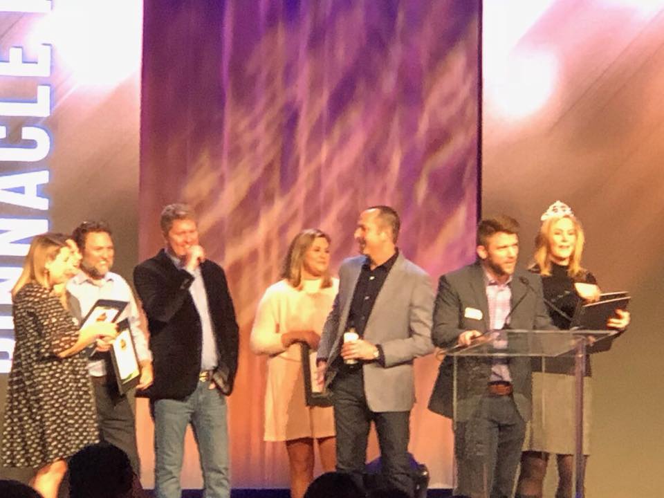
More Industry Awards! Pinnacle wins three Gold and two Silver Technology Awards at PPAI Expo 2018!

More Industry Awards! Pinnacle wins three Gold and two Silver Technology Awards at PPAI Expo 2018!

Michael Phelps won 28 Olympic medals. Michael Jordan won five NBA MVP Awards. Robert Frost was awarded four Pulitzer Prizes. And to that pantheon of multi-award winners, one would have to add Pinnacle Promotions.

At the PPAI Expo – the promotional products industry’s largest event – Pinnacle was awarded five Pyramid Awards: three Golds and two Silvers. The Gold Awards represent the second consecutive, and third overall, Gold for eCommerce Website; the second consecutive Gold for Promotional Video; and first for Website/Content (for PinnacleBrandedSolutions.com). This year’s haul brings Pinnacle’s total to 15 awards from the PPAI since 2012.

Read the full press release here >


Posted by Admin, 0 comments