Promotional marketing is like a puzzle – a multifaceted game where every piece must fit to achieve the desired outcome. Whether you’re an entrepreneur just starting out or a seasoned marketer looking to revamp your strategy, understanding the essence of promotional marketing as a problem-solving endeavor is key to success.
In this blog, we’ll explore why promotional marketing is all about problem-solving and share some of the best techniques and tips to ensure your promotional efforts hit the mark. We’ll also delve into the world of promotional gifts and items that work effectively. So, let’s dive right in!
The Problem-Solving Nature of Promotional Marketing
Before we dive into techniques and tips, it’s essential to grasp why promotional marketing is inherently a problem-solving endeavor.
Imagine this: You have a fantastic product or service, but nobody knows about it. This is a common challenge faced by businesses of all sizes. You need to find a way to bridge the gap between your offerings and your target audience. That’s where promotional marketing comes into play.
Promotional marketing is essentially the art of identifying and solving problems. It’s about recognizing the barriers that stand between your product and its potential customers and then using creative strategies to overcome those barriers.
The Best Promotional Marketing Techniques
Now that we understand the problem-solving aspect of promotional marketing let’s explore some of the best techniques to tackle these challenges effectively.
Know Your Audience Inside Out
One of the most critical aspects of promotional marketing is understanding your target audience. Who are they? What are their preferences? Where do they spend their time? What problems can your product or service solve for them? The better you know your audience, the more precisely you can tailor your promotional efforts to meet their needs.
To truly understand your audience, start by conducting market research. This can involve surveys, focus groups, or one-on-one interviews with existing customers to gather insights into their needs, preferences, and pain points.
Additionally, you can utilize online analytics tools to track website and social media engagement, allowing you to see which demographics are showing the most interest in your content or products. Combining these approaches will help you build a comprehensive profile of your audience, guiding your promotional marketing efforts in the right direction.
Craft a Unique Value Proposition
Your promotional efforts should clearly communicate the value your product or service brings to your audience. What sets you apart from the competition? How can you make your offer irresistible? Craft a compelling value proposition that answers these questions and resonates with your audience.
Embrace Multichannel Marketing
In today’s digital age, it’s essential to reach your audience where they are. Utilize various marketing channels, from social media and email marketing to content marketing and pay-per-click advertising. A multi-pronged approach ensures you’re casting a wide net.
Leverage the Power of Promotional Gifts
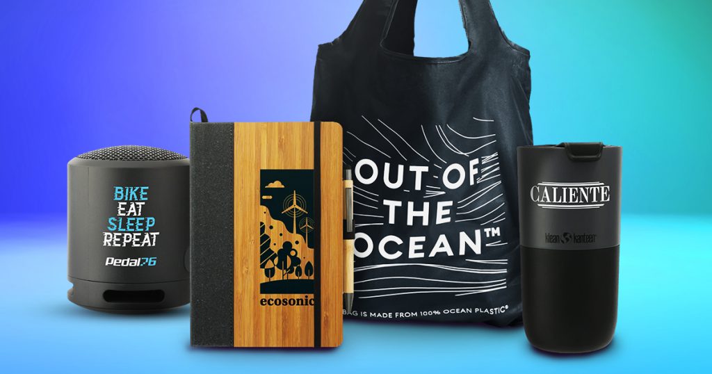
Promotional gifts can be a game-changer in your marketing strategy. These are tangible items that carry your brand and message, making them memorable. Consider practical, high-quality promotional items that align with your audience’s needs and preferences. Think custom-branded reusable water bottles, stylish tote bags, or tech gadgets.
Measure and Adjust
Promotional marketing isn’t a one-and-done endeavor. It’s an ongoing process that requires constant monitoring and adjustment. A great way to measure performance is by A/B testing. It allows you to make data-driven decisions and refine your promotional strategies based on what resonates most effectively with your audience.
You can also track the performance of your campaigns using metrics like website traffic, conversion rates and sales. Use this data to refine your strategy and make improvements.
Putting it All Together: Promotional Marketing Tips in Action

Let’s set the scene — you own a cozy local coffee shop in a neighborhood filled with competition from big-chain coffee giants. Your challenge is to entice more customers to choose your coffee shop over the larger, more widely recognized brands.
Problem: Your coffee shop is struggling to stand out in a sea of coffee options, and you need to find a way to attract and retain more customers.
Breaking Down the Promotional Marketing Solution
Know Your Audience: You survey your regular customers to better understand their preferences. You discover that many of them value the personalized and friendly atmosphere of your coffee shop and appreciate locally sourced ingredients.
Craft a Unique Value Proposition: Based on the survey findings, you create a unique value proposition that highlights your coffee shop’s local charm and commitment to supporting local farmers. You emphasize the cozy ambiance and the personal touch that sets your coffee shop apart from the large chains.
Embrace Multichannel Marketing: You utilize social media to share behind-the-scenes stories of your coffee shop, showcase local suppliers and engage with the community. You also send out personalized email newsletters offering exclusive discounts to loyal customers.
Leverage Promotional Gifts: As part of your promotional strategy, you offer reusable coffee mugs with your logo and a discount code for future purchases. These mugs not only serve as promotional gifts, but also align with your brand’s sustainability values.
Measure and Adjust: Using data from your email marketing campaigns and social media engagement, you notice a steady increase in customer engagement and loyalty. Through A/B testing, you discover that email subject lines mentioning “local flavor” perform exceptionally well. You adjust your content strategy to emphasize this aspect even more, leading to increased foot traffic and sales.
In this real-world example, the local coffee shop used promotional marketing to solve the challenge of competing with larger coffee chains. By understanding their audience, crafting a unique value proposition, employing multichannel marketing, leveraging promotional gifts, and measuring and adjusting their strategies, they successfully attracted and retained more customers, ultimately boosting their business.
Promotional Items That Work
Now that we are more familiar with the best promotional market techniques let’s take a closer look at promotional gifts and items that have proven to be effective problem solvers in promotional marketing:
Custom Tote Bags
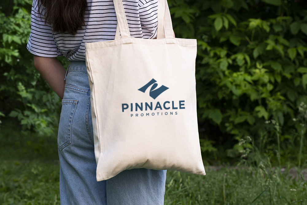
Custom tote bags are eco-friendly, versatile and budget-friendly, making them a popular choice for promotional marketing. They serve as walking billboards for your brand, and people tend to reuse them regularly, whether for grocery shopping, running errands, or carrying their essentials, ensuring your logo gets plenty of exposure.
Branded Apparel
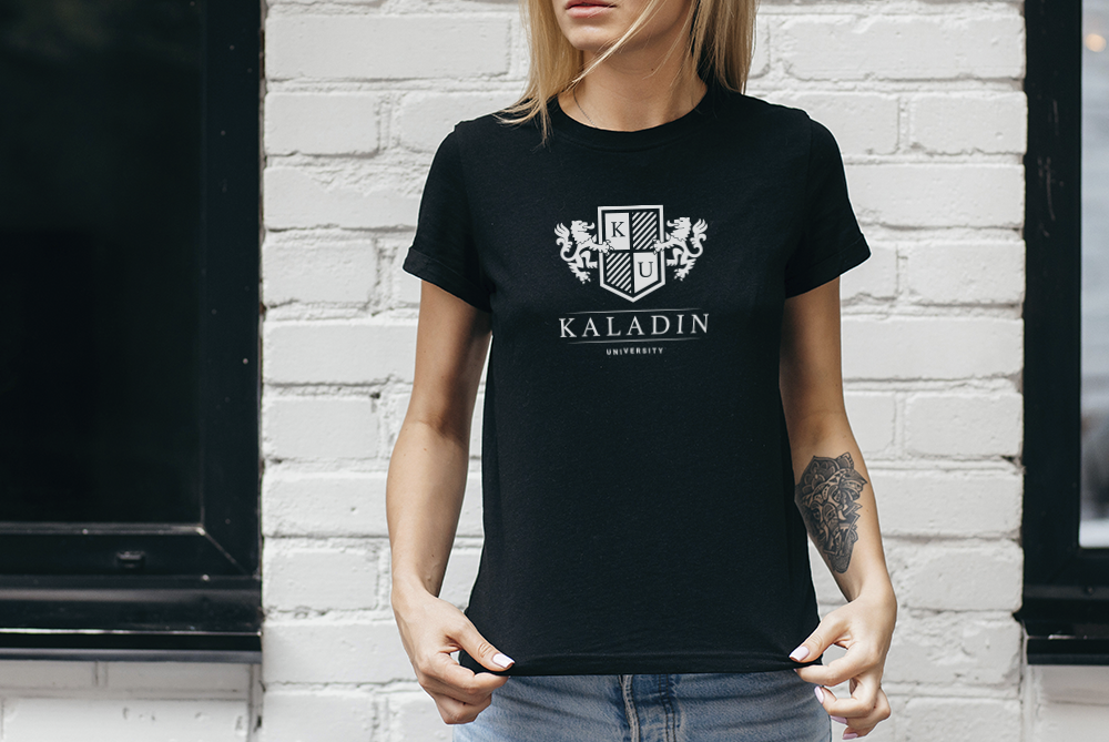
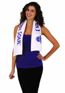
Apparel is a timeless promotional item. Whether it’s custom-printed T-shirts, hoodies, or caps, branded apparel allows your audience to wear your logo proudly. Your logoed apparel can spark conversations and create a sense of community among those who support your brand. Plus, it’s a great way to add style to your promotional efforts and make a lasting impression.
Promotional Drinkware
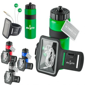
Promotional drinkware, including water bottles and branded tumblers, are perfect for health-conscious audiences. These items not only encourage hydration, but also serve as on-the-go billboards for your brand.
What’s more, tumblers, in particular, have gained remarkable popularity on social channels like TikTok and Instagram. Their stylish designs and versatility make them highly shareable, often featuring in user-generated content and stories, amplifying your brand’s visibility among wider audiences. So, consider adding these trendy and practical items to your promotional marketing strategy for a modern touch.
Custom Notebooks
Custom notebooks are timeless promotional items! They’re perfect for jotting down ideas, notes, or sketches, making them an ideal choice for businesses in creative or educational fields. Your brand’s logo on a quality notebook reinforces your commitment to quality and creativity.
Tech Gadgets
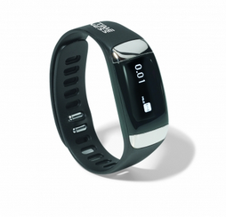
Branded tech gadgets like phone stands, chargers, and earbuds are always in demand, reflecting the tech-savvy nature of today’s consumers. By offering these items as promotional gifts, you demonstrate that your brand is tech-savvy and forward-thinking, aligning your image with modernity and innovation.
Remember, the key to success with promotional items is to choose those that align with your brand and resonate with your audience. Don’t just slap your logo on anything; make sure the item adds value to the recipient’s life!
Get the Best Promotional Marketing Tips With Pinnacle Promotions
Promotional marketing is, at its core, about solving problems. It’s about connecting your product or service with the right people in the right way. By knowing your audience, crafting a compelling value proposition, utilizing various marketing channels, and leveraging effective promotional items, you can navigate the challenges of promotional marketing successfully. So, embrace the problem-solving nature of promotional marketing and watch your brand thrive!
Ready to put these problem-solving promotional marketing techniques into action? At Pinnacle Promotions, we specialize in helping businesses like yours create memorable and effective promotional campaigns. From custom tote bags to branded apparel and everything in between, our wide range of promotional items is designed to make your brand stand out.
Let’s work together to find the perfect promotional solutions tailored to your unique needs. Get in touch with us today, and let’s start solving your marketing challenges with creativity and flair!

