Helvetica is a brand of die-hard fans — fans so raving they actually create their own promotional products. Some of you are all like wait-hold up-what’s a Helvetica? right now.
Helvetica is not just a typeface — what the elite call fonts — it is the typeface. To most of us, a typeface is the invisible structure around a message. To designers, the typeface is the message.
Just as social media nerds have woven Twitter stockings and sewn Facebook pillows, font nerds have been busy designing promotional products for their beloved typeface. I present designer Beverly Hsu’s Helvetica cookie cutters:
You can check out her full post with more photos here.
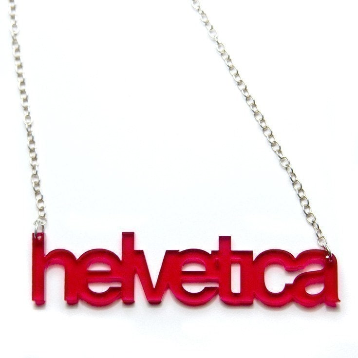
Helvetica is a brand that people want to be identified with. If I like Helvetica, that means I am a certain kind of person: creative, savvy, in the know about design. My best friend knows that I want to be known as that kind of person, which is why she bought me this necklace:
I’m curious; is there something inherent about Helvetica that gets people so excited? Or can this enthusiasm be crafted, with the right efforts behind marketing and advertising, or with an attractive company culture? What ingredients could you pour into your brand that would make people want to wear it around their necks? Is it even possible?
I’d love to hear your thoughts.

How would you describe the type of person likes Papyrus?