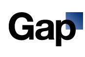
 Many companies use promotional products when re-branding their corporate logo, as they are an effective, inexpensive way to show off one’s new identity. Maybe people would have been more receptive to Gap’s new logo unveiled this week if they got some free stuff promoting the new design. Maybe not…
I think the corporate and brand identity opinion site, Brand New, sums up the feelings of the general public with their interpretation of the new logo:
“Just as some folks hate Gotham in logos, I hate Helvetica in logos. It has the unique ability to make anything look pedestrian and, in this particular case, it makes Old Navy, Gap’s low-end retail sister, look like a luxury brand by comparison. The shaded square on the corner doesn’t help at all either — I’m not one to critique something by saying it looks as if it were done in Microsoft Word but this one is just too unsophisticated to warrant anything more than that.”
The site www.craplogo.me might do an even better job of solidifying wide public opinion of the new logo into one word that you can probably guess by the URL. The site even lets you type in your own text to get your own Crap, I mean Gap, logo.
