Welcome to this week’s edition of “Trending Topic Tuesday,” where we share our take on what’s going on in the world and what promotional products would appropriately (or inappropriately) market the subject matter.
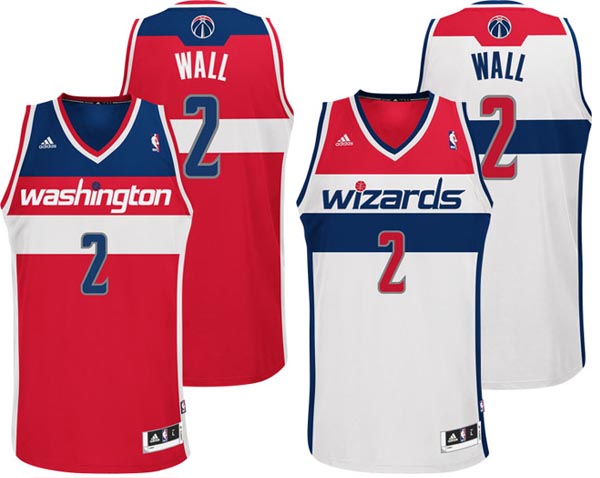
The Washington Wizards, a professional basketball team based in Washington, D.C., held a press conference this morning to unveil a new franchise logo as well as new home and away jerseys that pay homage to the team’s history.
The new logo apparel is an updated take on the old Washington Bullets uniform. The Bullets became the Wizards in 1997.
The Wizards’ new home jersey, pictured at left, is primarily white, while the new away jersey is primarily red. Both jerseys feature a red, white & blue color scheme that matches the uniforms worn by the other D.C.-based teams that also play at the capital city’s Verizon Center: the Mystics (WNBA) and the Captials (NHL). The team’s logo apparel has featured a number of color schemes over the years, from navy and orange to black and bronze; however, the Wizards’ only NBA championship was secured 33 years ago when they wore red, white & blue as the Washington Bullets. The new jerseys are quite similar in color and in style to the ones worn by that winning team, albeit with a few modern influences: ‘washington’ on the away jersey and ‘wizards’ on the home jersey are both spelled with lowercase letters, and the design of each is crisp, clean and contemporary.
In addition to the color scheme, the Wizards’ new logo apparel also pays homage to the Bullets in a subtle design feature: the upstroke of the ‘d’ in the lowercase ‘dc’ that appears on the away jersey is accented with a hand reaching for a ball, which mimics an old Bullets logo.
The new design has been well-received by players and fans alike. What do you think of the Wizards’ new jerseys?
